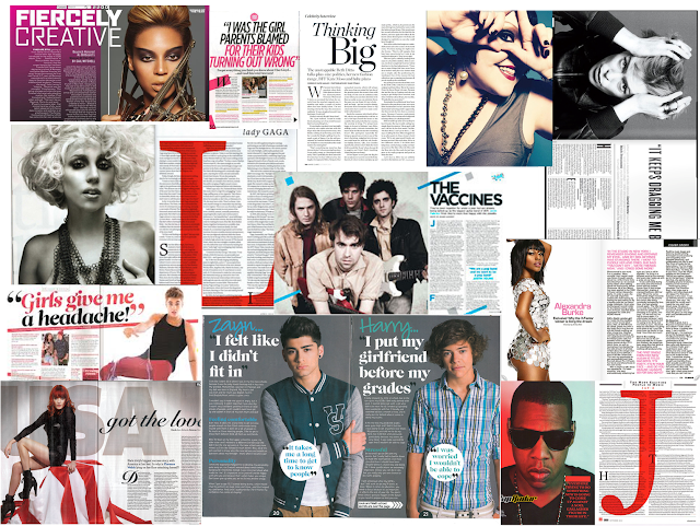
I like the idea of my double page spread being revolved around a white background, therefore when producing this moodboard I mostly included spreads with a white background. Magazines such as 'Q' have a well set out double page spread and I like the fact that they have an enlarged initial of whoever the article is about. When I did this research when producing the moodboard I noticed that almost every double page spread has an image of whoever the article is about on one side and the article on the other. I think this layout is effective as it looks clear and well set out. A lot of the spreads have pull-out quotes which I feel makes the article look professional.


No comments:
Post a Comment