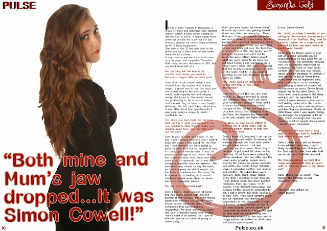
I also think the image works well with the pull quote as in the image she looks like a shy innocent normal girl, not a diva etc, and the fact that her jaw dropped when she saw Simon Cowell shows that she wasn't expecting much, or someone so famous to actually be coming to see her.
I tried 2 other images to be used on the double page spread but after alot of thinking i decided upon the one above as it was more relevant to the article and the innocence from it that she puts across. The images below were those that were considered for the place.


No comments:
Post a Comment